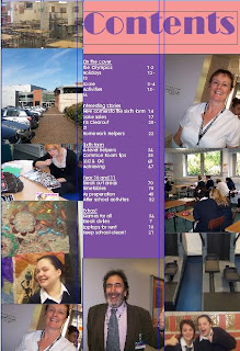
I have learnt allot of things about technology when creating my product. I used desktop publishing to create a professional looking magazine front cover, contents page and double page spread. I created my contents page and double page spread using Quark express, I had never used this software before so I learnt how to create something by using that, I learnt how well structured a magazine actually is. Moreover, I also learnt that by using desktop publishing that anyone with the right software can produce a professional looking magazine.
I also learnt allot about my photography skills, I learnt how to take a picture using different angles to connote different implied meanings. I also learnt how to take creative pictures and fitting them into the contents of the magazine.
I also used adobe photo shop to create my front cover of my magazine, this helped to me to make sure everything was in line with each other and that all the little details are completed and that there is no mistakes. This gave the magazine a more professional look, as I used tools such as effects on the sell lines so they look more professional and fit into the genre of the magazine.

