The front cover of my magazine follows the codes and conventions of a magazine cover because there is a large title which fills the cover of my magazine also my magazine has coverline which is the main feature in the magazine (Weatherhead High School). My coverlines are a one or two words, they attract the readers eye to read on leaving them on a kind of cliffhanger. With my coverline there is a small setence (cover lines) and a image which anchors the auidence to read my magazine, my coverlines are in a smaller text, so the reader are automatically attracted to the coverline not the subline. This is consistant throughout my whole design of my magazine cover. Moreover I have a large image of a model for my background, the reason why i have chosen the model that I have is because she is a student at weatherhead high school so this goes with the main feature of the magazine.
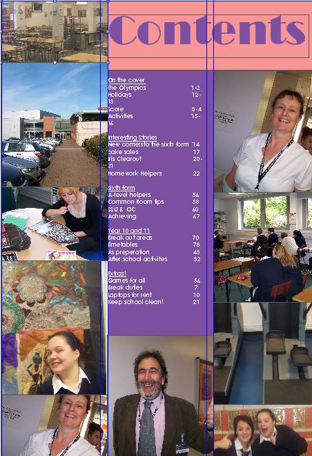
Furthermore, the barcode is also on the front of the magazine so there can be advertisement on the back of the magazine. Above the barcode I have the date, the issue number, and the price this follows the codes and conventions of a magazine cover. Also my front cover and contents page are consistant with eachother according to colour scheme and font, so this follows the codes and conventions of a magazine cover and a contents page.
I have used no buzz words on my magazine front cover but I have other ways to intrigue the reader, I have used colourfull and eye-catching images and bright text so the reader will automatically be drawn to my magazine over anyone else's as it is full of colour. In addition the colour scheme matches with the target auidence (11-18).
Moreover my magazine follows the codes and conventions by not having boring photographs, my photography vary, so this will keep the readers interested in my work. My main image on my front cover is related to my main coverline (Weatherhead High School).
I used new media technologies in the making of my product my using a new high tec camera in taking my pictures, this helped me capture my pictures in the best possible detail. Moreover, I used quark express to make my contents page instead of photoshop this improved the quality of my work as it is a better piece of software.
The strenth of quark express is the fact that because it is a better piece of software it instantly makes my work easier to improve as it is more advanced than your avarage photoshop. So for this reason alone my contents page improved because I can do things in quark express that I cannot do in photoshop, for example; I can easily colour the background in sections on quark express but photoshop it can become complicated with text box's and it could easily go wrong. The weakness of using quark express is the fact that not just anyone can use it, they have to be good at working programms. Also, people have to learn how to use quark express, so this can be very time consuming.
The strenths of the high-tec camera compared to any other camera is firstly, the obvious fact that the quality will be better so for example there would be less smudging and the camera would be able to capture images that wouldnt normally show up on a reguar camera so for instance something very far away, or something really zoomed up, that would normally be fuzzy on a regular camera. On the otherhand the weakness's of using a high tec camera is the cost of the camera compared to a normal camera, also if the camera was to get damaged then the expenses will be almost doubled compared to a normal camera repair. Moreover, some people may find a high-tec camera harder to use in comparison to a normal camera as there is more buttons so there is more confusion when some people just want to take a stright forward picture.