This is the first screen grab that I did when making my music magazine front cover, before I took the screen grab I opened the picture that I created and put it on to an A4 layout, after this I got the title and used the magic rubber on the title to get rid of any white marks, this made the title transparent, I did this because it makes my magazine look more professional. Moreover, I then moved the title onto the picture, I then used the rubber to rub out around the picture, this made the title go behind my picture so it wasn't covering her face, this added effect and professionalism to the magazine.
This next screen grab shows that I have added all the text to the magazine, I have added the main coverline in a different text as I wanted this is stand out and entice the reader when on the shelf in the shop. Furthermore, the colour scheme on my magazine was maroon black and white, as they were the most popular colours when doing my questionnaire, I also edited the title to have a maroon outline so it fitted in with the rest of my magazine. I have also created a black box at the bottom of my magazine with names inside of different bands, this should stand out in my magazine and entice the reader.
This screen grab shows me changing my music magazine dramatically, it shows that I have changed the title as I believe that it is an improvement. I have done this because I believe the title on the right looks more effective and it connotes the stereotype of an indie music magazine, I also believe that the title goes with the picture more than the title on the left.
The next screen grab shows that I have changed my magazine, the first adjustment that I have made is that I have changed the font of the main cover line. I have done this because I believe that it would stand out more as the cover line is more bold. Another thing that I have changed within the music magazine is that I have changed the size of the bar code, I did this because I looked at other music magazines and I believe that, that is the right size for a bar code.The last change that I have made is that I have made all the text in line with each other as other music magazines don't have them not in a straight line together, so overall it makes the magazine look more professional, like it could be on a shelf
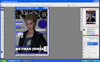
In this screen shot I have changed the colour of my magazine, although maroon is a popular colour when I was doing my magazine, it was not the most popular colour. Moreover I this is the reason why I changed it to blue, I also think the colour is more eye-catching and appeals to the target audience. I have also changed the layout slightly, I have done this because this makes my magazine look more professional. I have also added a circle, I have done this because I am going to add infomation into the circle and then this will entice the target auidence into looking at the magazine. The colour of the font in the circle is going to be white as this will stand out dramatically against the blue.
In this screen shot I have changed some of the text as I thought it would look more effective than the font that I chose originally, I chose impact as a font as I thought that it goes more with the genre of my magazine and it looks more attractive.
In this screen grab alot has changed the first thing that I have changed is the circle, I deleted that as it was over powering the main image almost so I decided to get rid of it so the readers can focus on the main image and the sell lines. Another thing that I have changed is the font of the main coverline, I have done this because I think it sticks out more with the genre of the magazine.


No comments:
Post a Comment